
Showing posts with label Independent Film Magazine. Show all posts
Showing posts with label Independent Film Magazine. Show all posts
Sunday, 13 April 2014

Independent Magazine: From First to Final Draft

.jpg) This is my second draft of my independent film magazine.
As you can see I changed the background to my image as I thought the woods in
my first draft didn't anchor my genre as much. However I replaced my previous
background with an block of flats estate which through research anchors my
genre well, also i thought adding a
sell line making it clear to my audience that my magazine is a independent film
magazine. I kept the typography the same but had a little play about with the
colour scheme and changed my masthead colour to black which was previously blue.
The reason for my change in colour is because I wanted to keep my colours
consistent and just use 3 different colours as in comparison to my first draft i used a range of
colours which doesn't make my magazine colour scheme consistent.
This is my second draft of my independent film magazine.
As you can see I changed the background to my image as I thought the woods in
my first draft didn't anchor my genre as much. However I replaced my previous
background with an block of flats estate which through research anchors my
genre well, also i thought adding a
sell line making it clear to my audience that my magazine is a independent film
magazine. I kept the typography the same but had a little play about with the
colour scheme and changed my masthead colour to black which was previously blue.
The reason for my change in colour is because I wanted to keep my colours
consistent and just use 3 different colours as in comparison to my first draft i used a range of
colours which doesn't make my magazine colour scheme consistent.This is my final version to my independent film magazine and there is evident progression from my first and second draft to my final version. As you can see from the three pieces I have kept the same image but have just manipulated it more and more, the difference between this image from my second draft is that I manipulated the complexion of my face making it much more clearer as I thought in my first and second draft my complexion looked quite dull due to the poor quality of the camera but I made full good use of the Photoshop software and solved the problem .Furthermore I made some changes to my background, I kept the same image but manipulated the colour and tuned down the colour making it look gloomy and less exotic as in my second draft the bright colours didn't really anchor my genre as much as I wanted it too. The dark colour scheme conveys my story line and its mainstream convention of the social realism genre. Due to the change in colour to my background my masthead colour had to change and couldn't stay black because it would clash with the background making the clarity difficult to recognise. However I researched colour schemes online and found out that red is a brilliant colour on black as it has various meanings like 'love and hate', 'danger and fate' etc. I changed the colour scheme from my previous draft as I thought the change was inevitable but I am contempt with my new colour scheme.
Created by Sean Okpa
Feedback on the Independent Film Magazine
Myah - Good image, maybe decrease the size to reveal more of the background.
Nadia - The background should anchor the genre more, woodland connotes a horror film more than a social realism film.
David - I think you should ad graffiti similar to the one used at the end of your trailer to help create more of a brand.
Enzo - Very significant improvements from the first draft. The background and the font used anchors the genre very clearly, I can instantly tell this is a social realism film.
Development of Independent Magazine
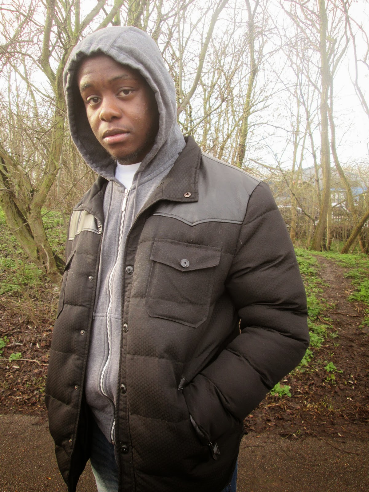 This is the image of our protagonist in our trailer 'Dreamz in the Hood' that I have selected to be used as the cover of our independent film magazine. As it stands the image is pretty basic, it was constructing in a Greenway hence the trees in the background and we don't feel as though it is a good representation of a independent film magazine therefore would need a lot of manipulation to fulfill what we aim to create which I will do in Photoshop.


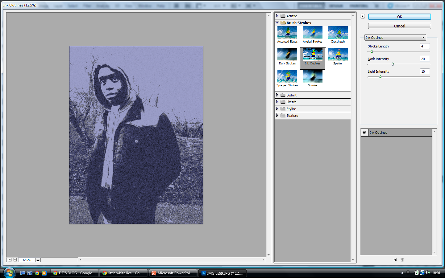
I wanted to further adapt this image and create a more artistic effect on the image. I did this by going to "filter", then "filter gallery". I selected the "ink outlines" filter which created a more defined image. I moved the "stroke length" to '4', "Dark Intensity" to '20' and "Light Intensity" to '10' so the light would balance the darker elements on the image as seen above.

I then decided to add other external features onto the front cover of the Independent Film Magazine. This
included a "barcode" which I added in a circle which I created using the "Elipse Tool". I used this to also add the title of the film magazine which was influenced by the 'Little White Lies' magazine. I also added the price of the magazine which is a convention of any magazine as consumers need to be made aware of how much they have to pay for the product.
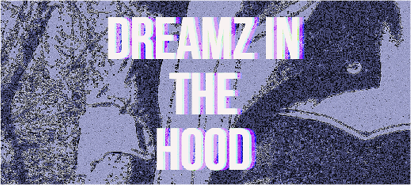
Lastly, I focused on the title 'Dreamz in the Hood'. I wanted the title to replicate the one seen on the actual 'Dreamz in the Hood' poster. This way my audience will be able to identify with our film through the magazine
Saturday, 12 April 2014
Feedback of Independent magazine
The magazine was very good in terms of the conventions of an independent magazine however I don't think its a magazine that portrays our film in terms of its story line. It doesn't really sell the story as there is nothing on it that seems appealing to the audience.
Thursday, 30 January 2014
Independent Film Magazine: Front Cover Selection


Sunday, 10 November 2013
Independent Film Magazine Preferences
 This is an example of the Sight and Sound Magazine which is published by the BFI featuring Johnny Depp. By analyzing this front cover I became interested in the pose of the actor. Most magazines feature images with a direct mode of address to compel and audience towards the magazine and the person featured on the front cover. This image however takes a different approach as it appears to be in motion and has no eye contact with the audience. I found this to be effective as it relates to the film and title "gangster special" as the image anchors the "gangster" impression with the gun and disguisable outfit.
  Here is another example of an issue which features Johnny Depp however, for his role in 'Charlie and the Chooclate Factory'. I chose to analyse this issue also as I feel it is a good embodiment of how each issue is adapted to suit the chosen film despite the magazine featuring the same actor. This image has a direct mode of address as it resemble the kind of character 'Willie Wonker' was for example, friendly and approachable which is what the direct mode of address helps to create through the image. The Logo for 'Sight and Sound' has also been adapted for this issue, however it is still identifiable by the use of yellow and black which is consistent among all issues, this helps to establish the 'Sight and Sound' brand which is important for customers when coming to by a magazine.
Created by Abena Amoako
Independent Film Magazine Preferences

Created by Sean Okpa
Edited by Abena Amoako
Saturday, 9 November 2013


Subscribe to:
Posts (Atom)