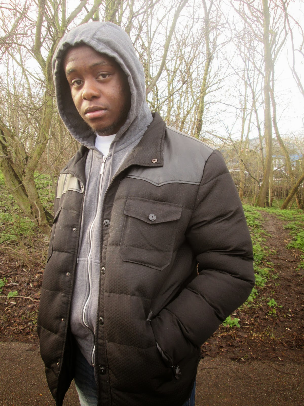
 This is the image of our protagonist in our trailer 'Dreamz in the Hood' that I have selected to be used as the cover of our independent film magazine. As it stands the image is pretty basic, it was constructing in a Greenway hence the trees in the background and we don't feel as though it is a good representation of a independent film magazine therefore would need a lot of manipulation to fulfill what we aim to create which I will do in Photoshop.


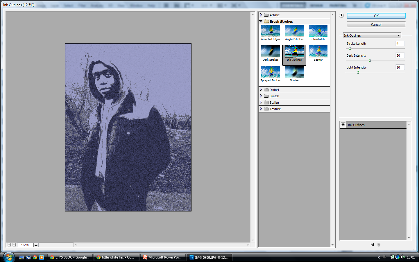
I wanted to further adapt this image and create a more artistic effect on the image. I did this by going to "filter", then "filter gallery". I selected the "ink outlines" filter which created a more defined image. I moved the "stroke length" to '4', "Dark Intensity" to '20' and "Light Intensity" to '10' so the light would balance the darker elements on the image as seen above.

I then decided to add other external features onto the front cover of the Independent Film Magazine. This
included a "barcode" which I added in a circle which I created using the "Elipse Tool". I used this to also add the title of the film magazine which was influenced by the 'Little White Lies' magazine. I also added the price of the magazine which is a convention of any magazine as consumers need to be made aware of how much they have to pay for the product.
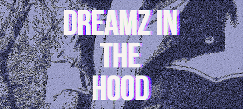
Lastly, I focused on the title 'Dreamz in the Hood'. I wanted the title to replicate the one seen on the actual 'Dreamz in the Hood' poster. This way my audience will be able to identify with our film through the magazine
No comments:
Post a Comment
Note: only a member of this blog may post a comment.